Projects /
Mirrari
Identity . Branding . Product Design
Retail
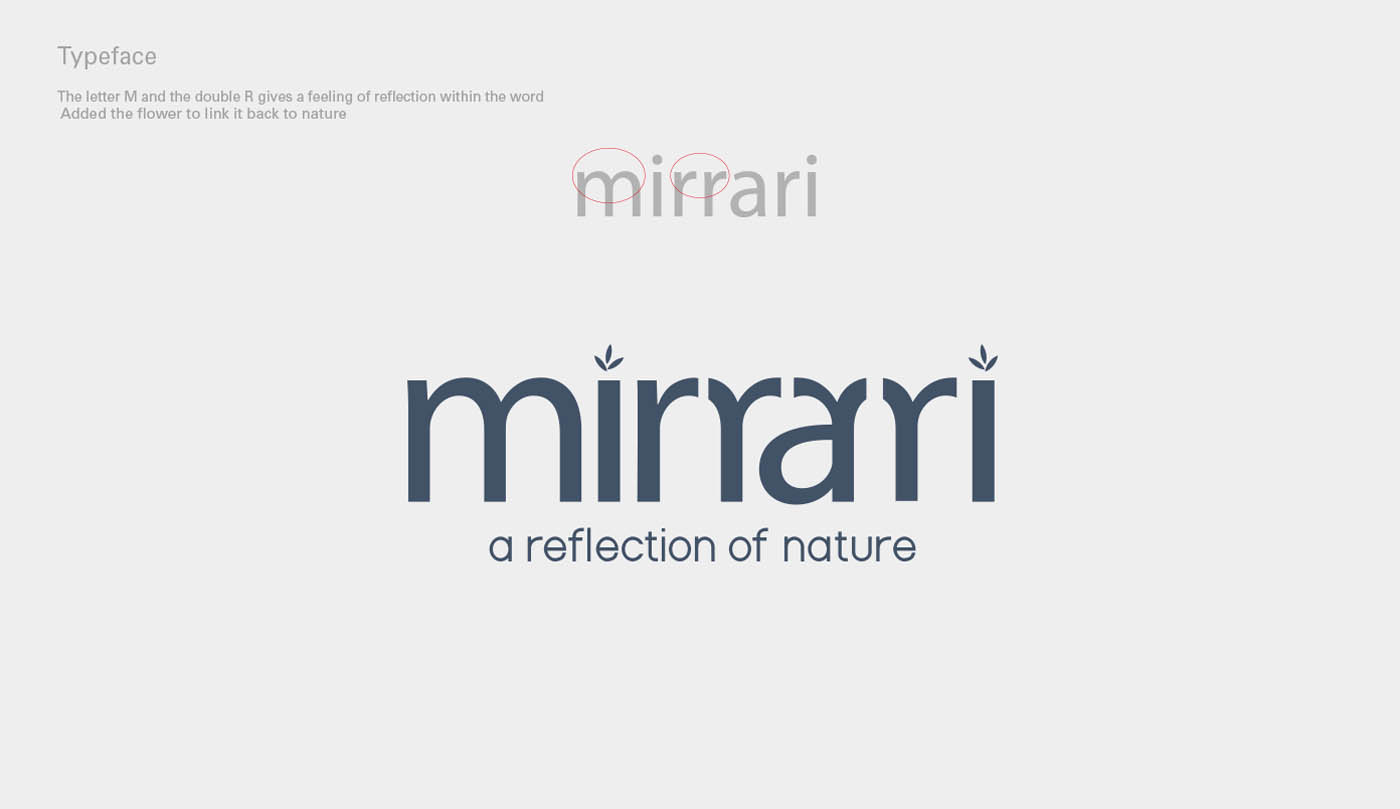
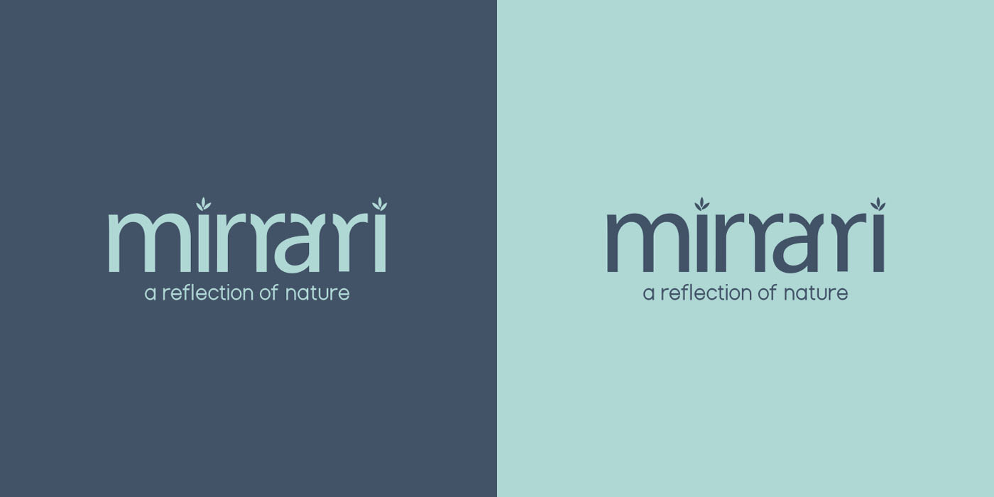
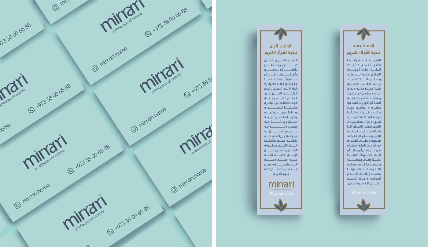
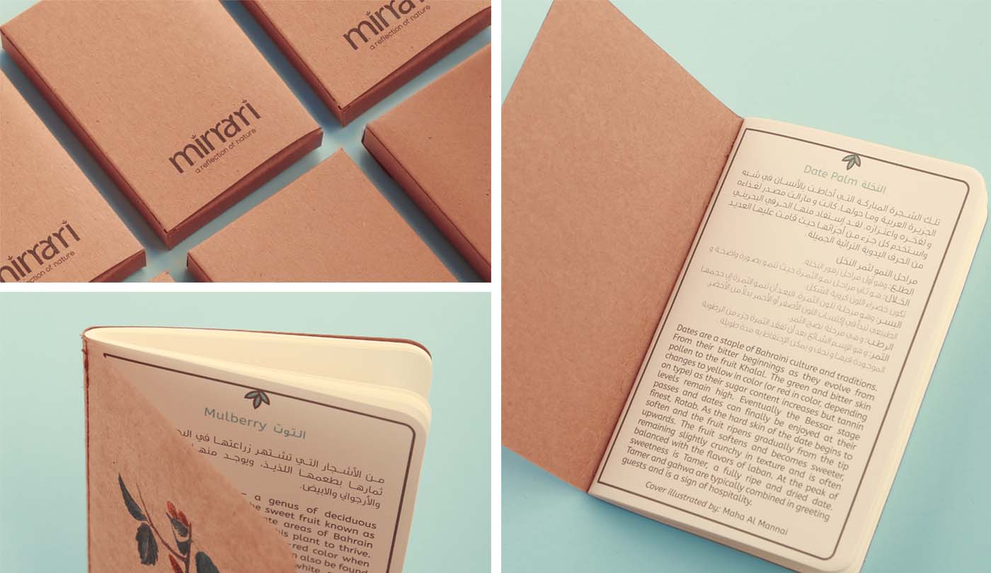
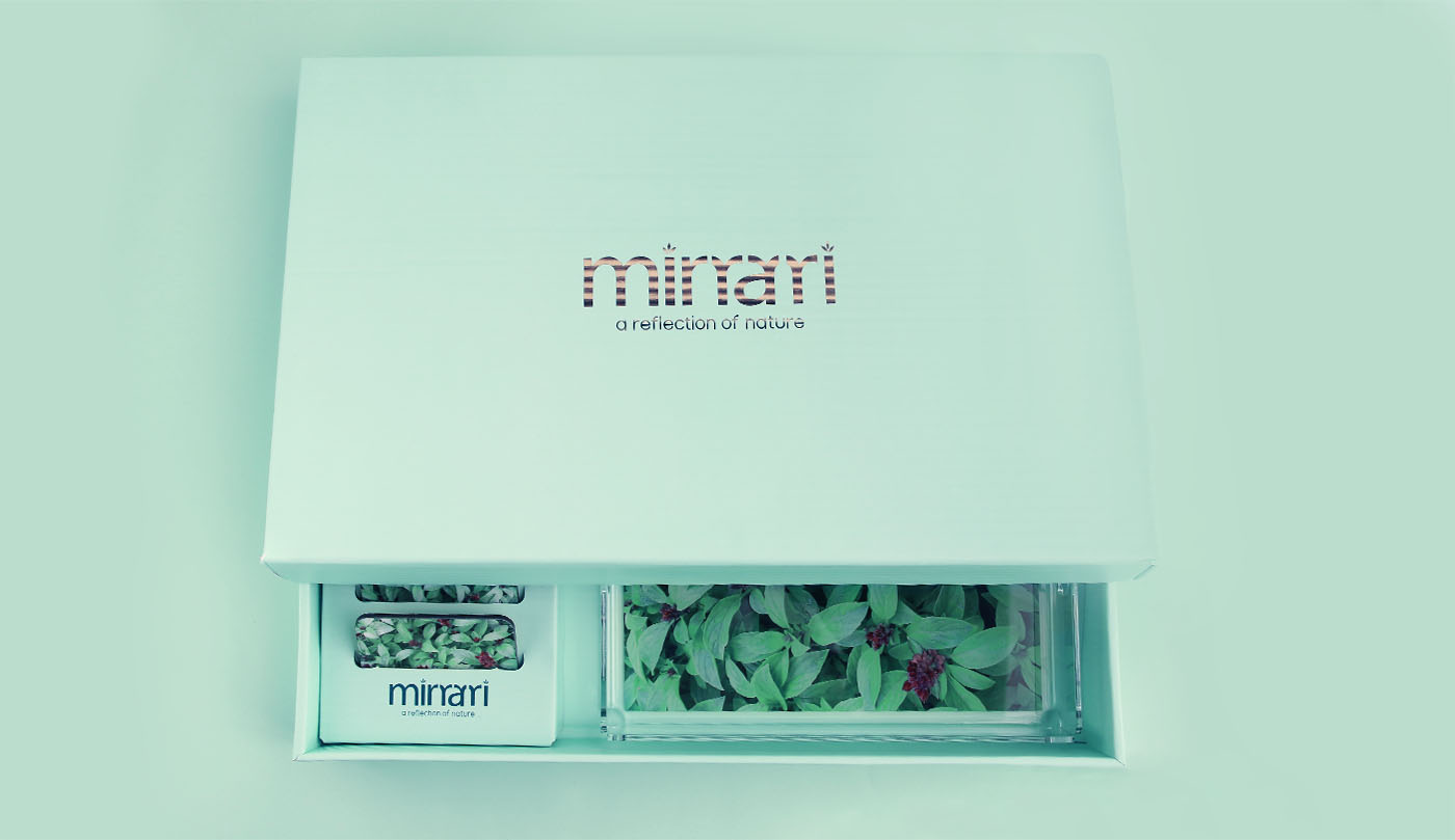
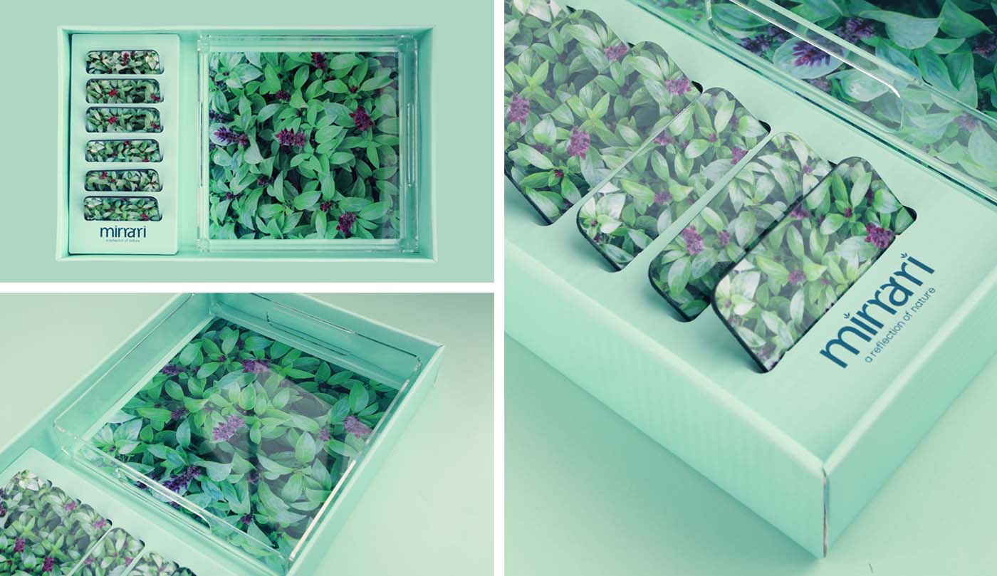
Creating a product stemming from a passion for nature was the roots of Mirrari. Several sources of inspiration were used to develop a brand and identity for this local start- up. By playing off the theme of nature, the colors blue and green were the natural selection for the logo to reflect the earthly inspiration of the products sold, whilst creating a sense of serenity as nature does. The letters ‘a’ and ‘r’ embedded in the logo have been modified to create the image of the letter ‘m’ which highlights the concept of ‘reflection’.
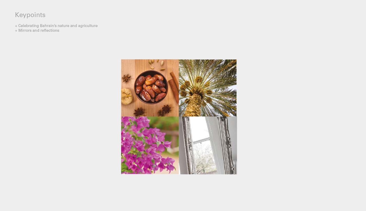
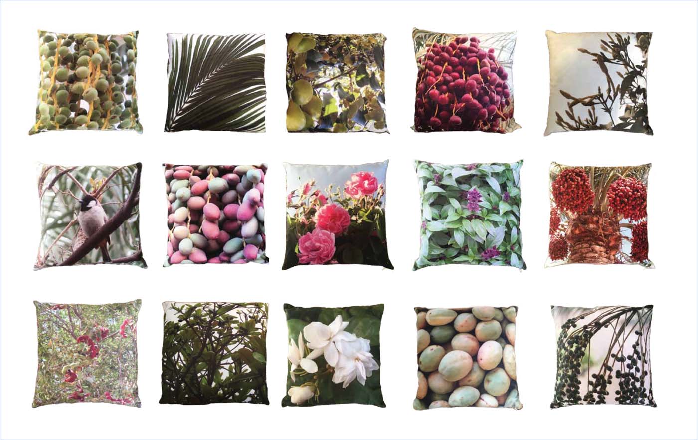
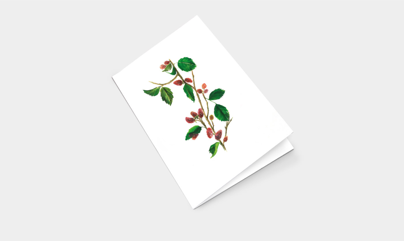
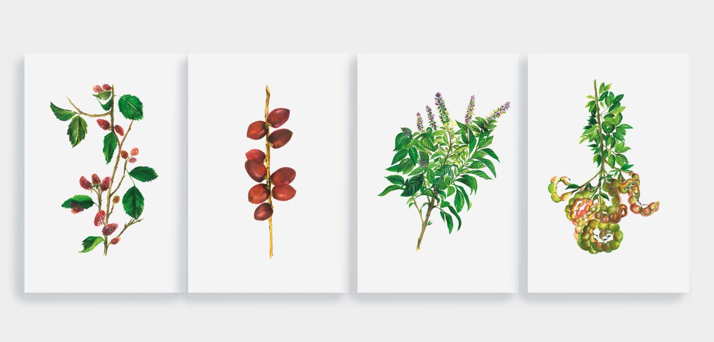
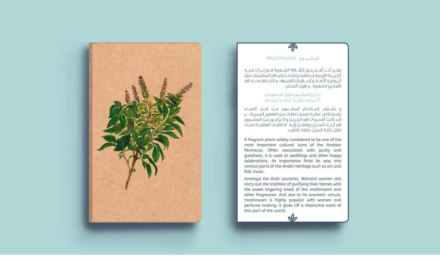
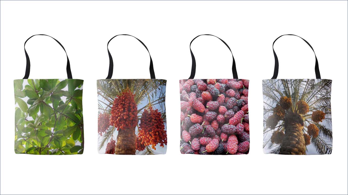
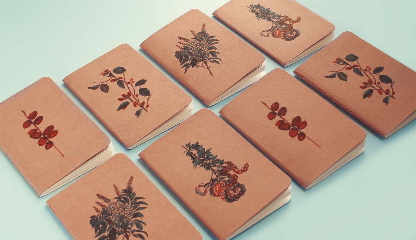
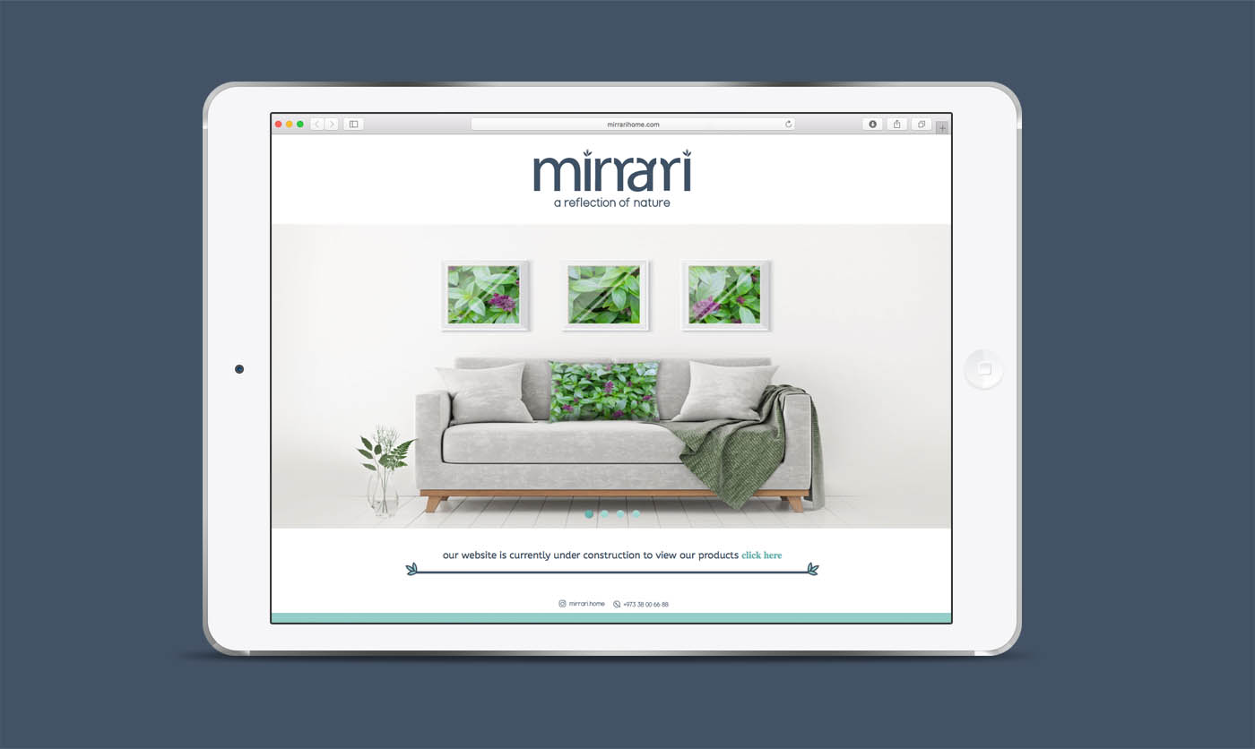
The concept ‘reflection of nature’ developed from the literal reflection – taking a photo of Bahraini nature and reflecting it into Mirrari products. As well as the emotional sense of reflection that one ponders and absorbs the beauty of nature and its surroundings. The word mirrari is a Latin word that comes from the Arabic word مرآهmeaning a mirror or reflection, further connecting the logo with the product.
We won't stop until
you love it!
Whether its brand development, product procurement, or interactive social media strategies you're looking for, we can help with it all! All our design solutions are tailored to your particular needs so stop over for a think and a coffee, or if you are far away drop us a line and we're sure to get back!
